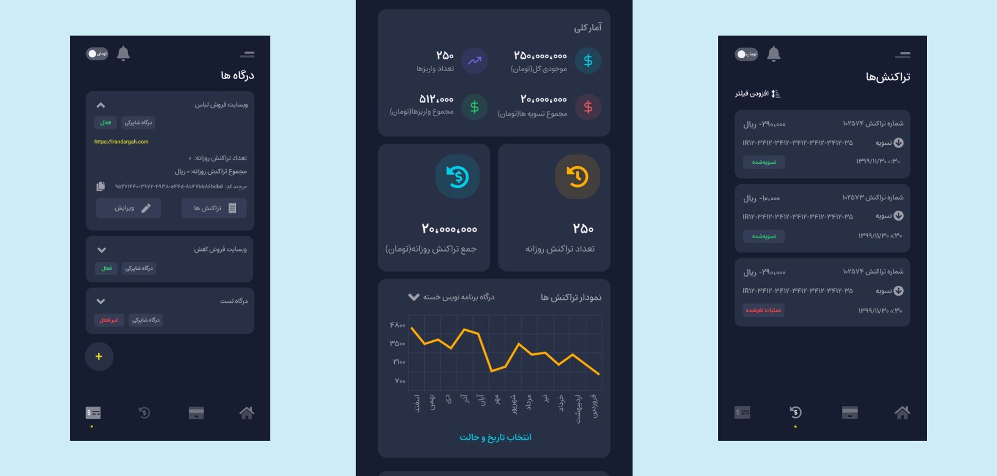

Irandargah Android Application UX Redesign
The Irandargah Android Application UX Redesign project, encapsulated a holistic Design Thinking approach over a span of 3+ months. This endeavor navigated through empathizing with users, defining core issues, ideating solutions, prototyping, and rigorous testing, leading to significant usability enhancements. The process, documented with professional rigor, offers a blueprint in transforming user-centric insights into actionable design improvements, creating a more intuitive and engaging user experience.

-
Year
2021
-
Client
Fardaye Sepid Ariana
-
Client's origin
Iran
-
Services
Product design
-
Project
Application redesign
Description
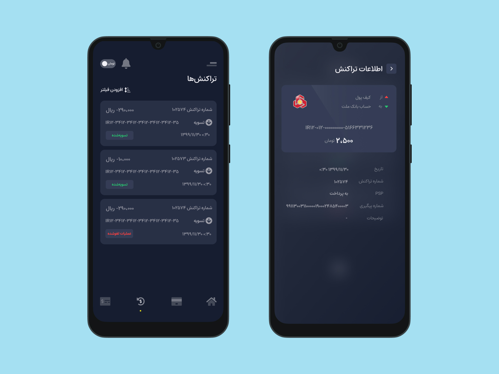
The Irandargah Android Application UX Redesign journey, spanning 3+ months, unfolded through the lens of Design Thinking. By navigating the phases of empathizing, defining, ideating, prototyping, and testing, this project translated user insights into design refinements. The result is a more user-friendly app, embodying both functional and aesthetic upgrades, making each interaction meaningful and delightful for its users.
Empathize:
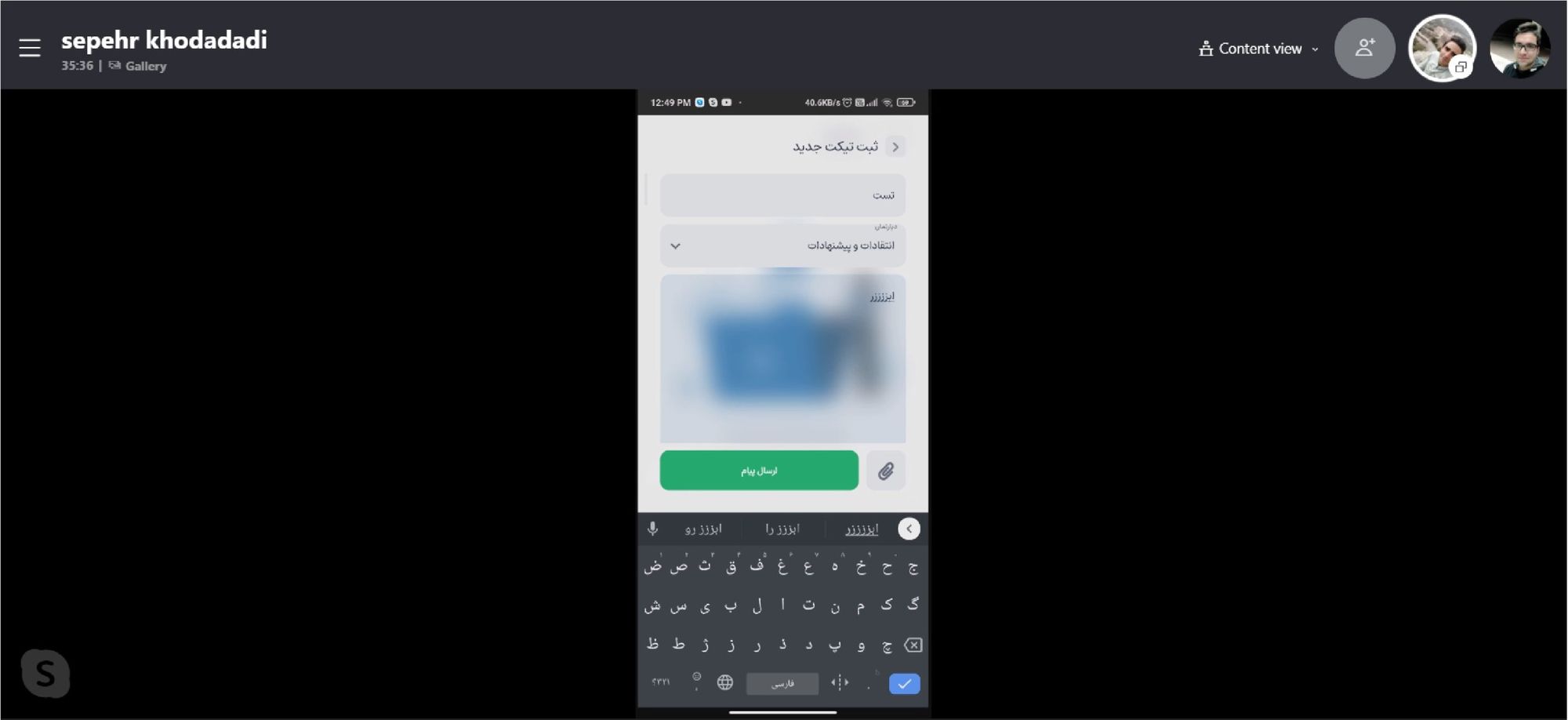
In the Empathize phase, a remote usability test was conducted with the app personas to gather firsthand insights. Users were asked about the application's navigational experience and to identify the main UI pain points. Their feedback provided a clear understanding of the user experience, shedding light on areas that required attention, and set the stage for the subsequent Define phase.
Define
Based on the data collected, several major pain points were identified which include:
1- Design System Inconsistencies:The previous application had critical problems with its design system, including poor color choices and illogical font sizes and weights.
2- Navigation Difficulties: Users found it hard to locate desired features, often feeling lost within the app due to subpar UX design.
3- Unclear Key Features: The application's key features were not easily comprehensible to new users, requiring a steep learning curve.
4- Unattractive Visual Elements: The visual elements were found to be boring and unclear, contributing to the application being undesirable.
Ideate & Prototype
During the Ideate phase, brainstorming sessions led to sketching various design solutions. Utilizing the feedback and data from stakeholders, the Prototype phase commenced. The initial sketches evolved into refined prototypes, marking the first tangible step towards redesigning the product to address the identified pain points and enhance user experience.
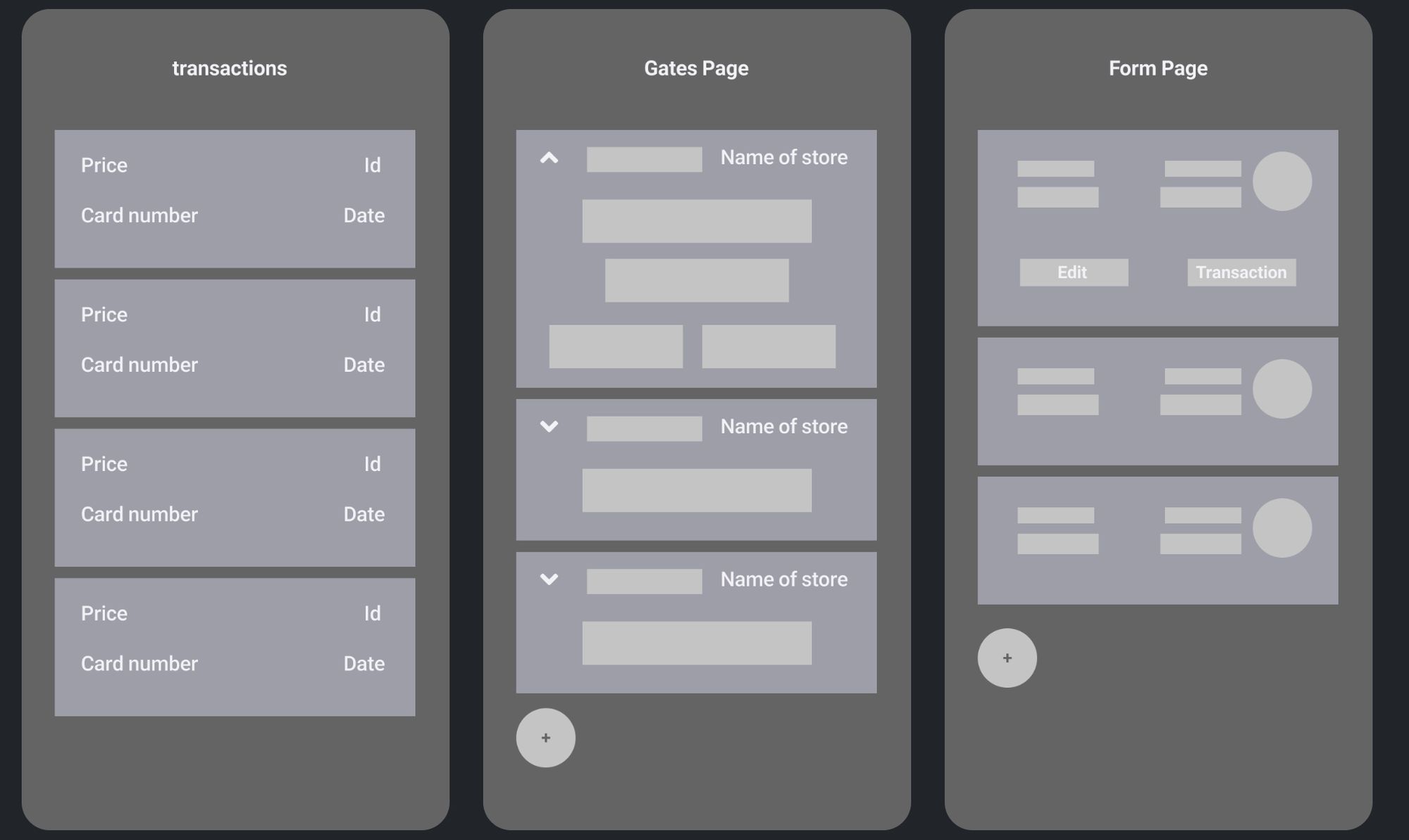
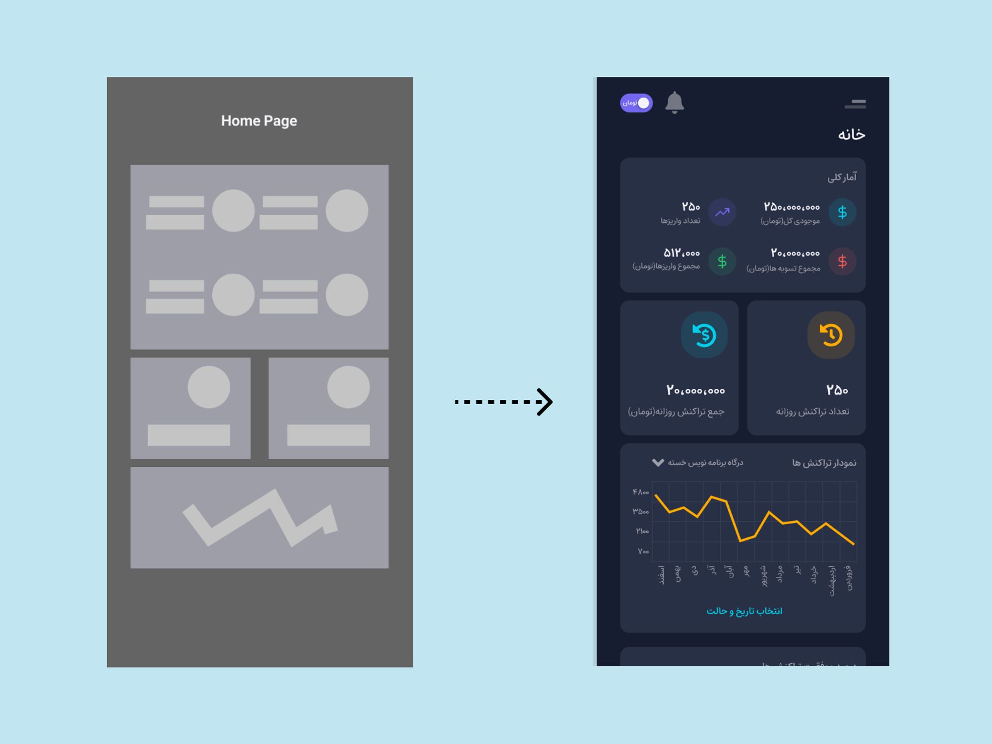
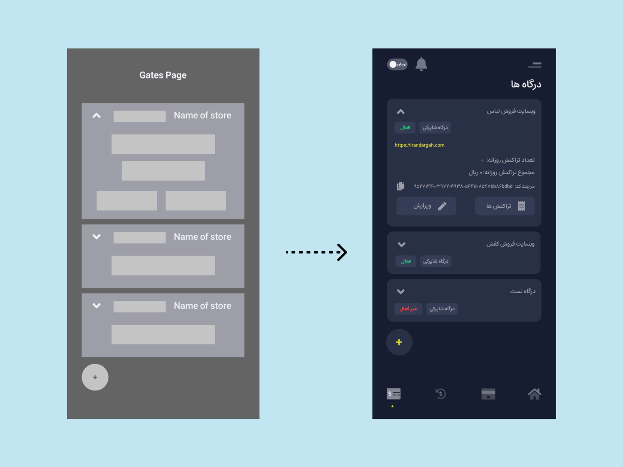
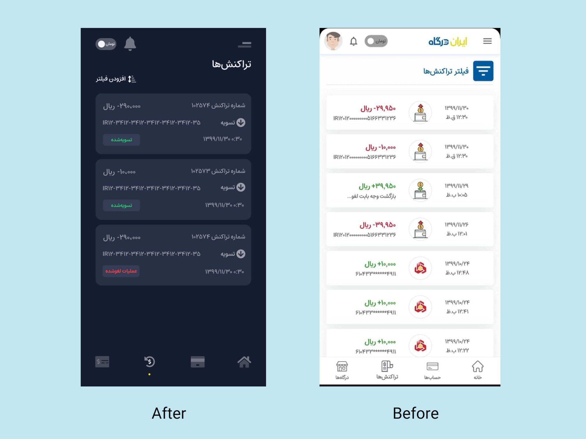
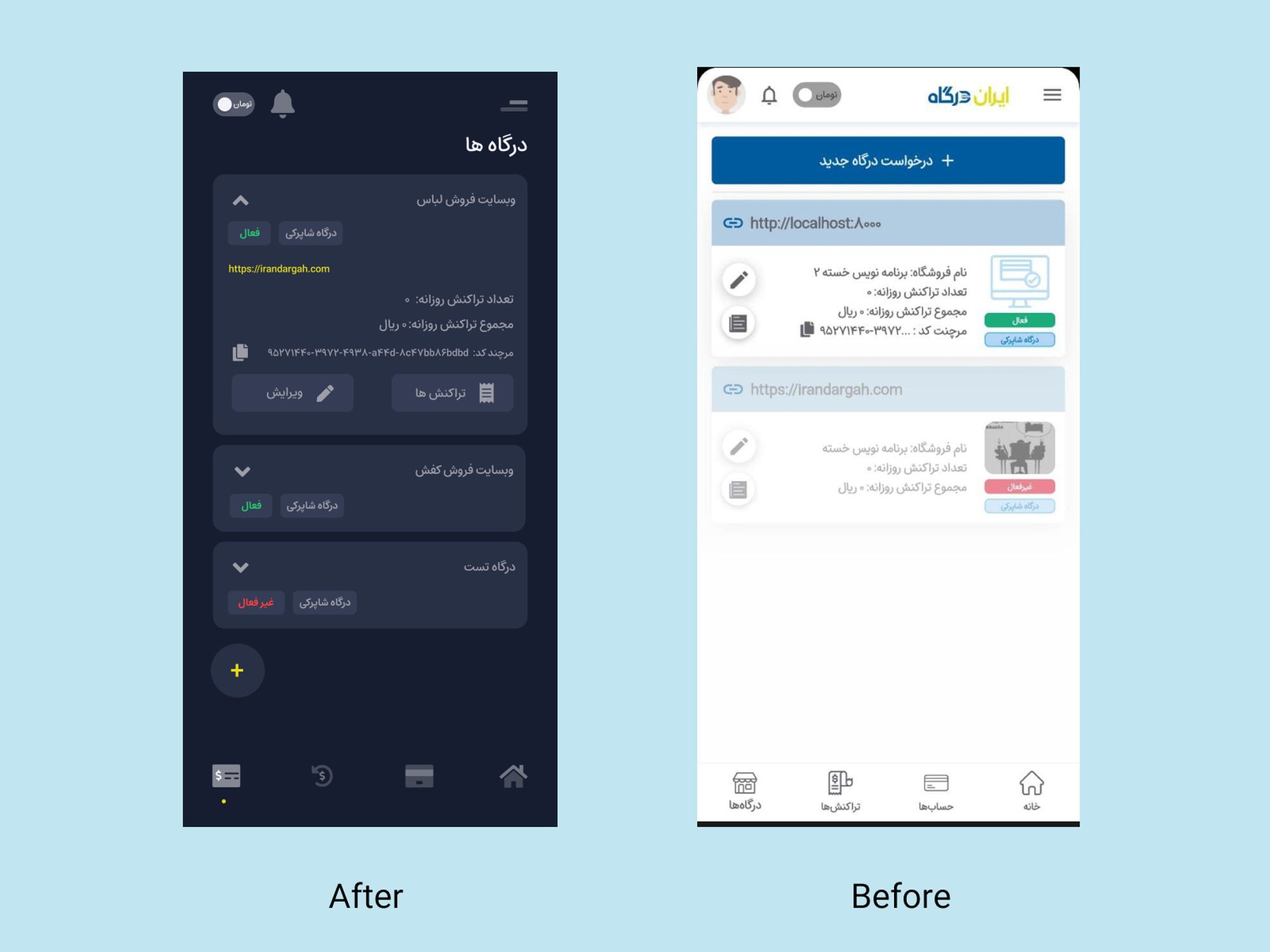
Before and After Comparison:
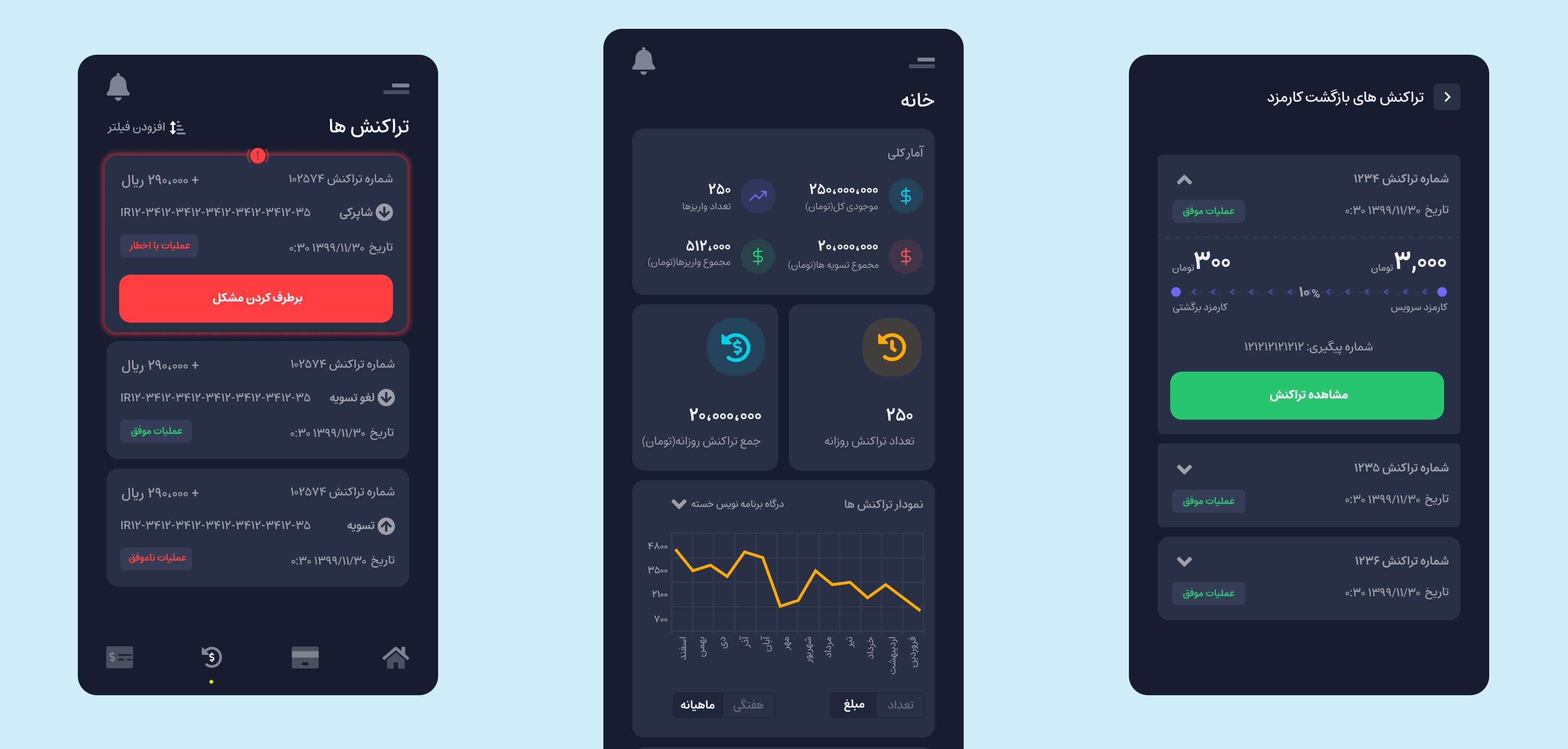
In this section, the contrasting visuals showcase the substantial improvements made in the new version of the application as compared to its previous iteration. The refined design not only addresses the earlier identified pain points but also enhances the overall user experience, making the application more intuitive and user-friendly.
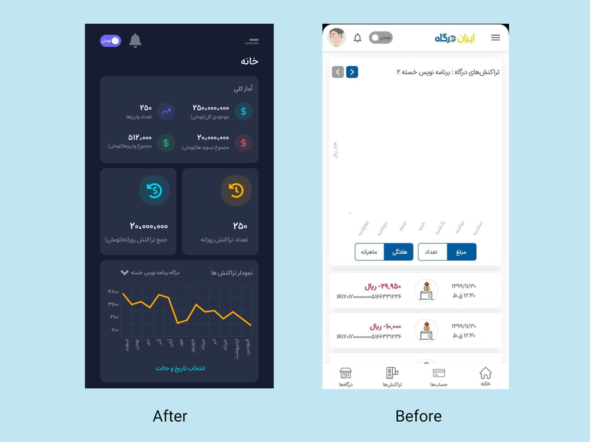
Test & Iterate:
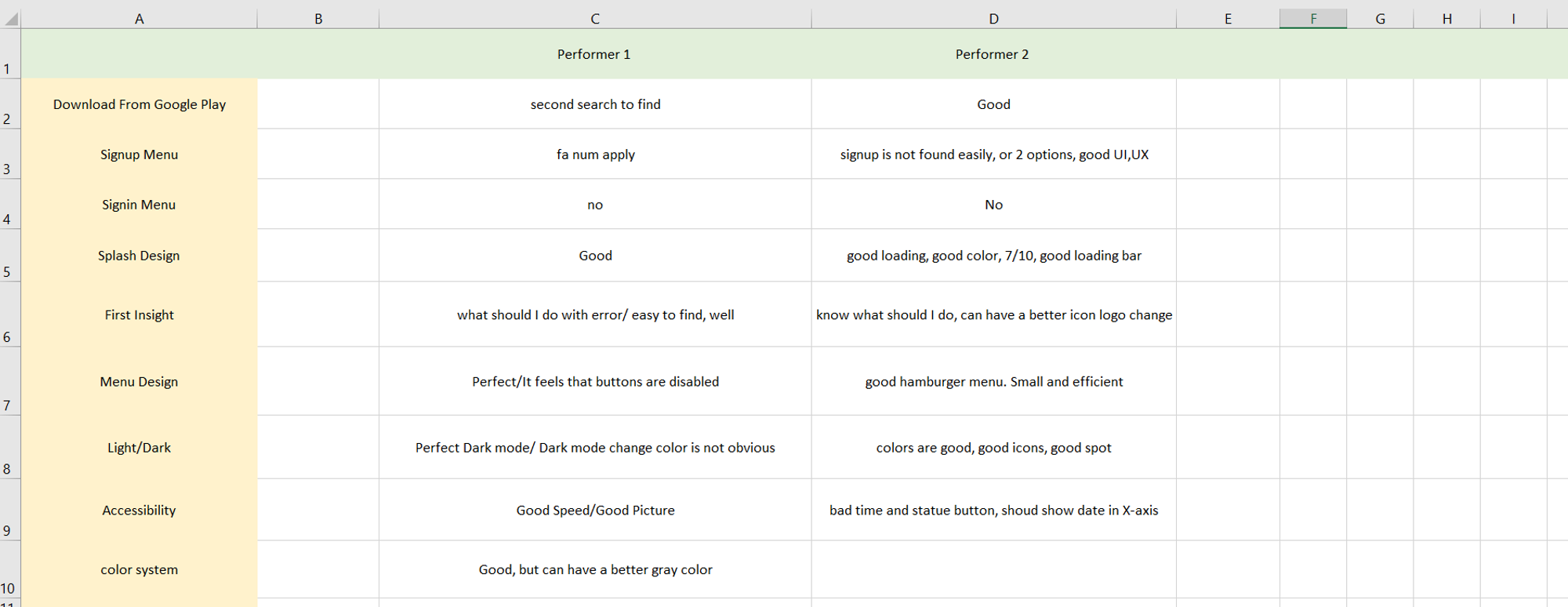
Post-development of high-fidelity prototypes, another usability test was conducted with two users to identify potential issues. The data collected fueled a continuous improvement approach, leading to the addition of multiple new features, further refining the application to better meet the user needs and enhance the overall user experience.

 Irandargah